CSS
1. 반응형 직사각형
.box::after {
  display: block;
  content: "";
  padding-bottom: 100%;
}
- tailwind로 구현한다면?
<div className="before:block before:pb-[100%]">
2. scroll-snap-stop
- scroll을 움직였을 때 처음 부분에 맞춰서 스크롤을 멈출 지, 중간에서 멈출 지, 끝에서 멈출 지 설정할 수 있다.
.snaps {
  overflow-x: scroll;
  scroll-snap-type: x mandatory;
  overscroll-behavior-x: contain;
}
.snap-target {
  scroll-snap-align: center;
}

.snap-force-stop {
  scroll-snap-stop: falways;
}
- Grid pile : 포갤 수 있음
flex vs grid
flex : 1차원
display- flex : block 특성의 컨테이너를 정의 (수직 쌓임)
- inline-block : inline 특성의 컨테이너를 정의 (수평 쌓임)
flex-direction- row, row-reverse, column, column-reverse
flex-wrap- nowrap : 기본 설정, 다음 줄로 넘어가지 않음. item의 너비를 줄여서 한 줄에 모두 배치
- wrap : flex 요소가 여유 공간이 없다면 다음 줄로 넘어가서 배치
- wrap-reverse : flex 요소가 여유 공간이 없다면 다음 줄로 넘어가서 배치. 단, 아래쪽이 아닌 위족으로 넘어감
align-items(수직 정렬)- stretch : 기본 설정, flex item의 높이가 flex container의 높이와 같아짐
- flex-start : flex 요소는 flex 컨테이너의 위쪽에 배치
- flex-end : flex 요소는 flex 컨테이너의 아래쪽에 배치
- center : flex 요소는 flex 컨테이너의 가운데에 배치
- baseline : flex 요소는 flex 컨테이너의 기준선에 배치
justify-content- stretch : 기본 설정, flex 라인의 높이가 남은 공간을 전부 차지
- flex-start : flex 라인을 flex 컨테이너의 앞 쪽에 배치
- flex : end : flex 라인을 flex 컨테이너의 뒷 쪽에 배치
- center : flex 라인을 flex 컨테이너의 가운데에 배치
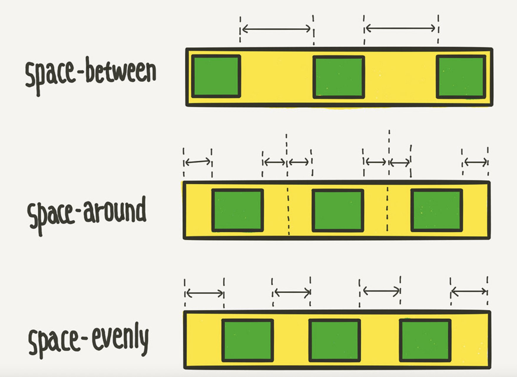
- space-between : flex 라인을 flex 컨테이너에 고르게 배치
- space-around : flex 라인을 flex 컨테이너에 고르게 배치하되, flex 라인의 양쪽에 동일한 공간을 추가
align-self- align-items보다 우선 적용되며, flex 요소마다 서로 다른 align 속성값 설정 가능
grid : 2차원
- 카드형식으로 되어 있는 신문형식의 레이아웃을 쉽게 만들고 여백을 쉽게 조절
display:grid;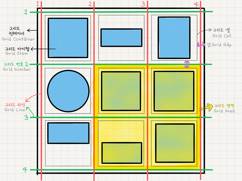
- grid container : grid의 전체 영역
- grid item : grid 컨테이너의 자식 요소들
- grid track : grid의 행과 열
- grid cell : grid의 한 칸
- grid line : grid의 가로선과 세로선
- grid number : grid의 행과 열의 번호
- grid gap : grid의 각 셀 사이의 간격
- grid area : grid의 영역
grid-template-columns: grid 트랙의 크기를 지정
.container {
    grid-template-columns: 200px 200px 500px; /* 열(column)의 배치 */
    grid-template-columns: 1fr 1fr 1fr  /* 1:1:1 비율 */
    grid-template-columns: repeat(3, 1fr) /* 1:1:1 비율 */
    grid-template-columns: 200px 1fr /* 200px : 나머지 비율 */
    grid-template-columns: 100px 200px auto /* 100px : 200px : 나머지 */

    grid-template-rows: 200px 200px 500px;    /* 행(row)의 배치 */
    /* grid-template-rows: 1fr 1fr 1fr */
    /* grid-template-rows: repeat(3, 1fr) */
    /* grid-template-rows: 200px 1fr */
    /* grid-template-rows: 100px 200px auto */
}
- fr : fraction 숫자 비율대로 트랙의 크기를 나눔
minmax(100px,auto): 최소 100px ~ 최대 자동으로 늘어나게